the project
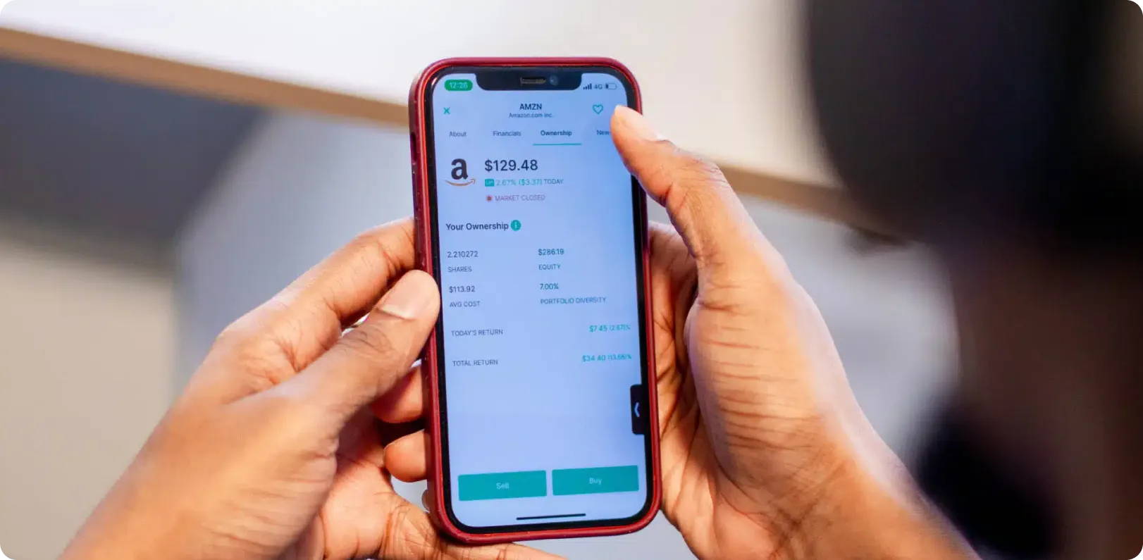
Bamboo lets Nigerians buy US stocks, mutual funds, and fractional shares, using dollars they’d converted from naira inside the app.
In a country where the local currency had been losing value against inflation for years, the product was two things at once: a hedge, and for anyone who traded well, a way to build wealth in a currency that held its value.
When it launched in early 2020 there wasn’t really anything else like it operating at scale in the Nigerian market.
I designed the whole product from January 2020 through August 2021 as the sole product designer. Twenty months, running from the first sketches through launch on iOS and Android, then a full redesign at the one-year mark and the growth phase that followed.
my role
I came in at the beginning. The first two or three weeks were tight collaborative work with the founding team, establishing the shape of the app and testing ideas against what engineering could build under time pressure.
From there I handed designs for iOS, Android, and web to the development team, then worked closely through implementation on interactions, gestures, and animations. That’s the texture that separates a shippable app from a memorable one.
After launch my scope kept widening. I owned the mobile app, the web app, the admin panels operations used, and the corporate website. I collaborated with the client’s brand designer and illustrator to keep the visual language consistent across product, marketing, social, and print.
By the time the redesign came around a year in, I was one node in a working group of roughly twelve people: engineers, product, the client, and their team from marketing, comms, and customer support.
two bamboo-specific notes on how i worked
the discovery gap
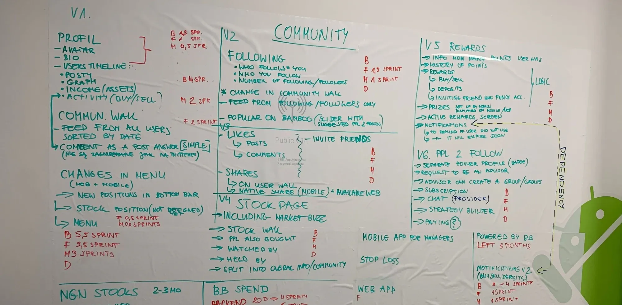
Client constraints meant we couldn’t fund a proper discovery phase at the start, so I did one on my own over the first few weeks. Personas, user stories, competitor analysis, with occasional support from the client’s UX researcher when their calendar allowed.
A product without foundations expands into questions you can’t answer later. I’d rather do the work unprompted than watch decisions get made without it.
doing my own ui audit
At the one-year mark the client commissioned an external UX audit. I paired it with a UI audit I did myself, based on what I’d learned building the product and the customer support signals the team had been collecting. Together, the two audits became the brief for the redesign.
the problem
At the start, the problem was building a niche product fast: a mobile-first investing app for a market where nothing quite like it existed, for a client with a strong idea and a sense of urgency but no fixed timeline.
The design had to bend two directions at once, towards Nigerian users’ constraints and expectations, and towards the US equities model the product was giving them access to.
A year in, the problem had shifted. The app was live, users were on it, feedback had accumulated, and Bamboo had a fresh brand. The product needed to catch up visually, structurally, and in the UX depth we hadn’t had time for the first time round.
the work
designing for the nigerian market
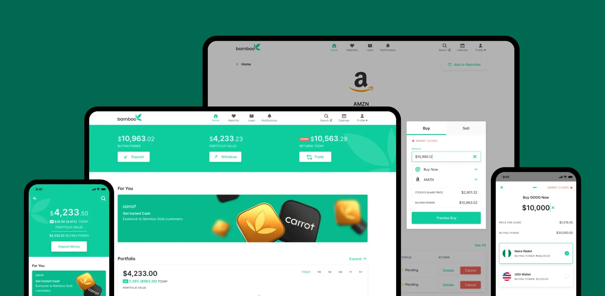
The concrete constraints shaped a lot of decisions. A large share of users were on low-end Android phones, which affected everything from screen density to how much a chart could carry.
The onboarding flow had to carry the whole KYC process, meaning identity verification, bank linking, and source-of-funds, for users often unfamiliar with any of it.
So I redesigned onboarding with KYC as its spine rather than an obstacle laid on top. The data visualization had a similar problem. It had to work for every John and Jane Doe on the platform, and a farmer opening the app to check their US-stock portfolio should be able to read the same chart a corporate analyst does. Simpler was almost always the right call.
the redesign
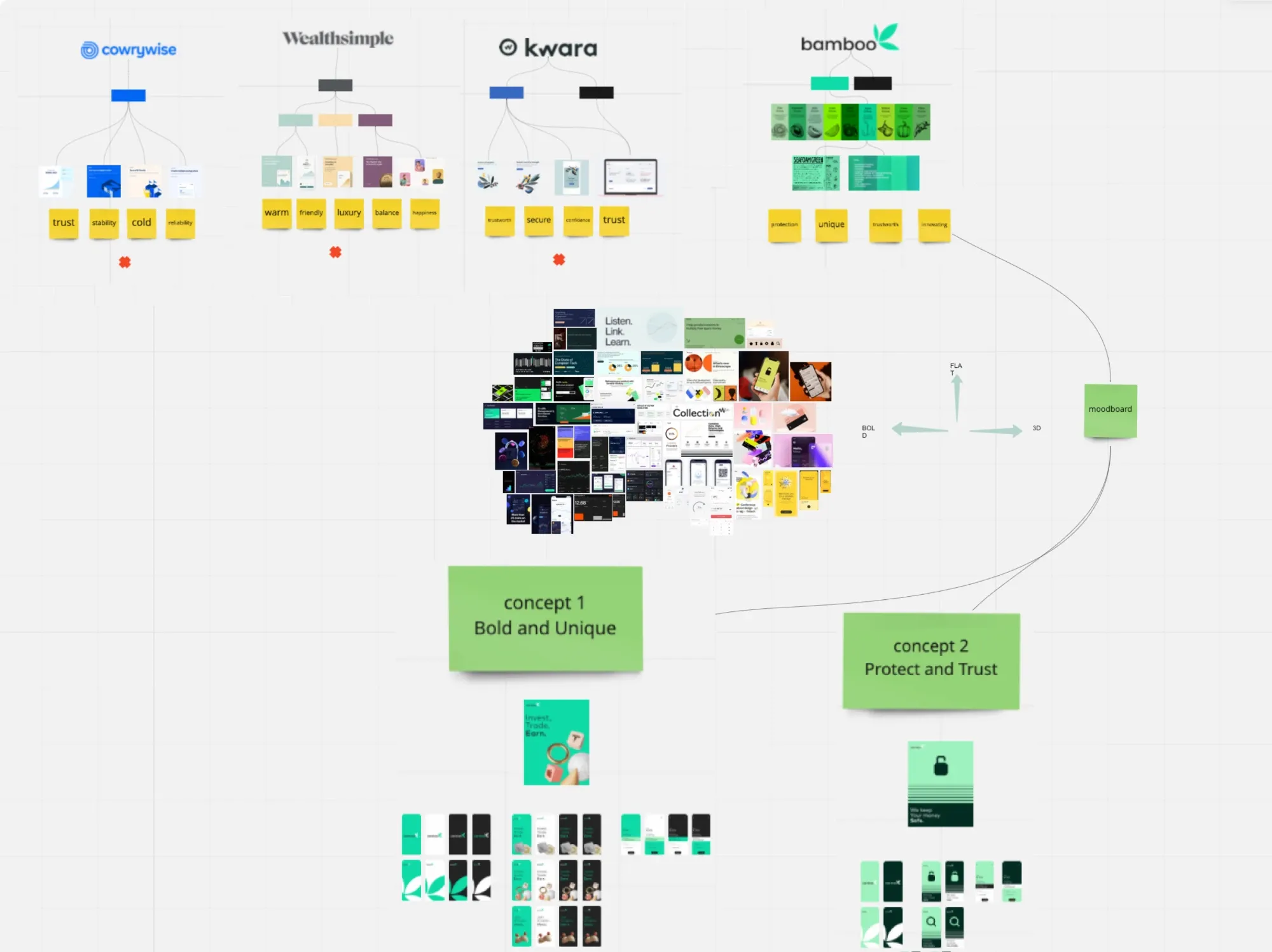
The external UX audit surfaced the user-behavior side. My UI audit surfaced the craft side: colour contrast issues, information hierarchy that broke down when data got dense, voice and tone that hadn’t kept up with the brand. Bamboo had just refreshed its identity, so the redesign brought in the new colour palette and introduced dark mode alongside it.
I wrote a full document, screen by screen, covering what needed to change, why, and what the change would do. Then I presented the proposals on the key screens first for client sign-off before rolling through the rest. Fully iterative from there, with the twelve-person working group weighing in on the paths through.
cross-surface breadth
The Bamboo brand had to hold together across the mobile app, the web app, the admin tooling, the marketing site, social media, and print, and I was the only product designer connecting most of those surfaces.
A lot of the work over the second year was that quiet consistency job, making sure a badge on Instagram and an empty state in the app spoke with the same voice.
I collaborated closely with the client’s brand designer and illustrator. My scope was the digital product side, theirs was the identity and illustrated world, and the seam between us was where the coherence had to happen.
dropping android from the design side
Around the redesign I made the call to design only for iOS. Three reasons.
- We didn’t have time for parallel design tracks and the redesign couldn’t wait.
- The Android developer was strong enough to translate iOS designs into platform-appropriate patterns himself, and we worked tightly through implementation so I could catch anything that needed platform-specific thinking, iOS-versus-Android modality being the classic one.
- My own experience across both platforms meant I could predict where translation would need attention without producing two full design sets. It’s a scoping tradeoff I still stand behind. The redesign shipped faster because of it, and the Android version didn’t suffer.
what shipped
- A mobile investing app live in the Nigerian market on both iOS and Android, growing through Bamboo’s creation, implementation, and growth phases.
- A full redesign that shipped the new brand, a dark mode, and clearer data visualization to a user base that had accumulated feedback we could now act on.
- Around 500 Sketch artboards across mobile, web, and admin surfaces, the substrate that let a small team keep the product coherent across contexts.
- Bamboo became one of the best-known trading apps in Nigeria. The company grew its own design team, the product matured, and we handed it off. Being there for creation, implementation, and growth, then knowing when to let go, was part of the design job.
Bamboo is live at investbamboo.com and has grown a long way past the version shown here. Happy to walk through the original flows or the redesign in more detail.